New Logo Design: Seattle Beach Volleyball Co-Op
It’s been a while since I got to design a new logo. I volunteered as the Social Media Manager for this beach volleyball co-op, which is a small community of enthusiasts with a wide range of experience levels trying to improve their skills and enjoy the game.
Process
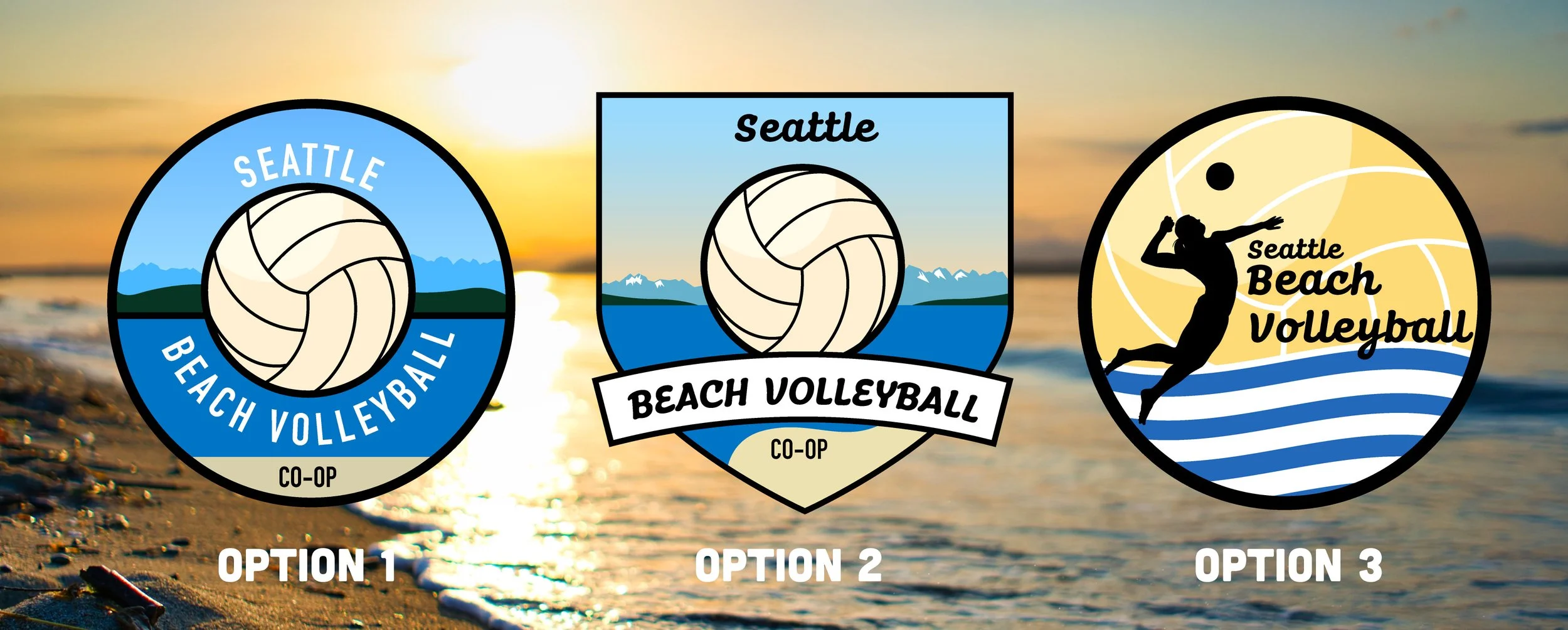
One of the best parts about living in the Pacific Northwest is the summer. The greens from the foliage and blues from the sky and waters really come out on these beautiful days. I knew I wanted these colors and a touch of yellow to be included in the palette.
California has such a strong brand for their beach volleyball community—they have palm trees, surf, and year-round sunshine. I imagined Seattle’s beach volleyball branding would be more along the lines of a campy feel to match the local lifestyle.
Sketches
In addition to the colors, the elements I wanted to emphasize were, of course, the volleyball, and typical scenes of a Pacific Northwest beach: trees, water, and mountains. I sketched these pieces together in Procreate and it was fun seeing the PNW outdoorsy icons next to a volleyball, which I associate with a tropical climate.
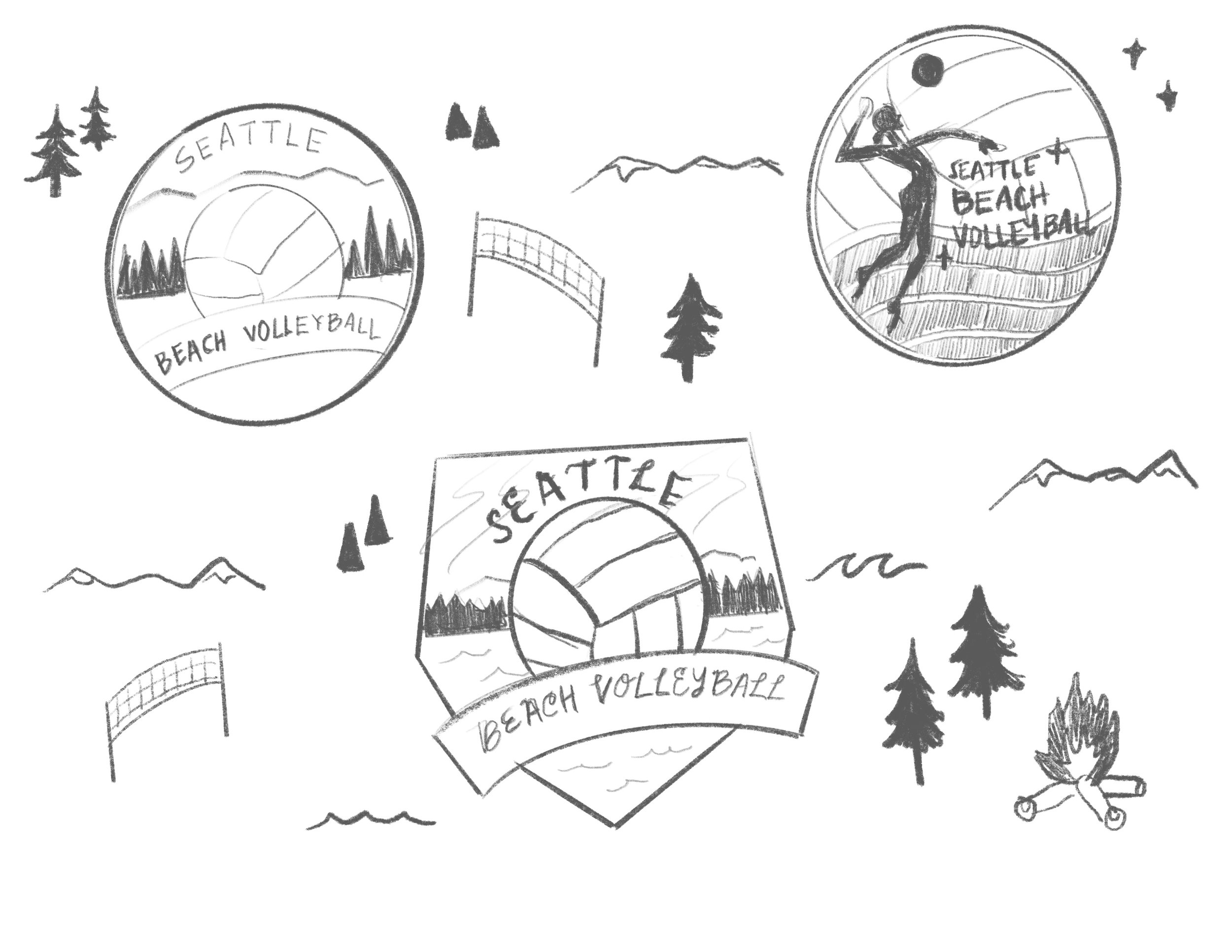
Seattle Beach Volleyball Co-Op Sketches
Vectoring
I really enjoy working in Adobe Illustrator because it allows me to bring my ideas to life and add color to my sketches. The greens and blues make the logos look like they belong in the cool climate of the Pacific Northwest. As you can see in Option 3, there are no greens and I think the logo looks like it is for a more tropical climate.
Background photo by Benjamin Massello on Unsplash
I really enjoy being part of this community and being able to use my skills in helping grow the sport of beach volleyball in this area. Let me know which logo you like best!